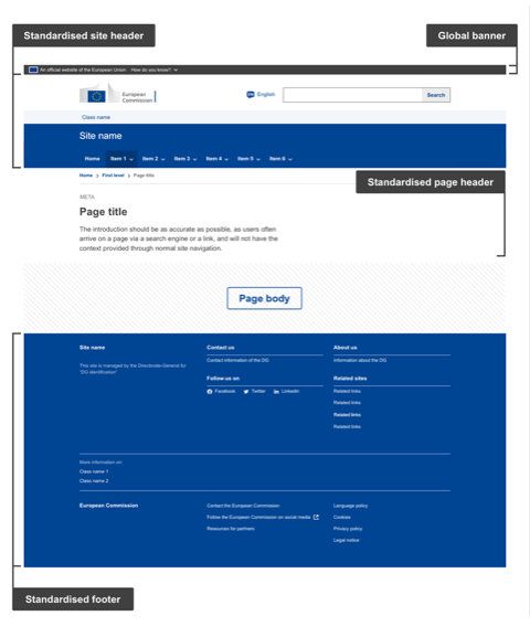
As defined, the European Commission branded Standardised websites host thematic content detailing, for example, policies for which the owner DG/Agency is responsible. This is the default solution to host DG-specific content (policy) and is closely aligned with the core site, providing seamless navigation and visual consistency between the first levels of the core site and the DG-managed sites.
Anatomy

- Mandatory
- Optional
| Elements | Mandatory | Description |
|---|---|---|
| Global banner | Yes | The Global banner is the official EU stamp that gives a visual indicator and easy access to EU institutions and bodies sites, guaranteeing the user visits an official EU website |
| Standardised site header | Yes | The Standardised site header is present on every page. It communicates the European Commission brand and provides basic structure and guidance. The site header is composed of several mandatory and optional elements such as:
|
| Standardised page header | Yes | The Standardised page header gives context and information to the user on what the page is about. It is present on every page, just below the site header, except for the homepage. The page header is composed of mandatory and optional elements such as:
|
| Standardised footer | Yes | The Standardised footer is present on every page. It provides supplementary information such as copyright, legal, privacy, social media, contact information and links to other important sections within the European Commission ecosystem. The footer is composed of mandatory and optional elements such as:
|
NOTE: On the Page body section, when components are available, use components from ECL.
Structural anatomy
When designing the page, make sure to follow appropriate category guidelines available below in terms of structure and layout
| Elements | Mandatory | Description |
|---|---|---|
| Grid | Yes | Enhance visual consistency |
| Colours | Yes | Use only European Commission colour specifications available in the ECL |
| Typography | Yes | Apply the typographic guidelines available in the ECL |
| Spacing | Yes | Apply spacing rules explained in the ECL |
| Icons | Contextual * | Where icons feature, use commonly-used icons from the ECL |
| Images | Contextual * | See image guidelines in ECL |
* Contextual – elements that may or may not feature on a page, depending on the communication and/or functional needs – for example, Login. Where the element features, use the ECL component.
Do's
- use for all new developments or newly developed sites
Don'ts
- do not replace pages only on existing websites as this will create visual inconsistencies, this must be done at a site level
When to use
- when creating or updating sites that are managed by a separate DG
When not to use
- do not follow these guidelines when you are updating sites that fall under the Core or Harmonised category