A textarea (text area) is an input field used on a form to request information from a user. Use a text area when the expectation is that a user will enter a large amount of information with their keyboard.
Anatomy
Default
| Elements | Mandatory | Description |
|---|
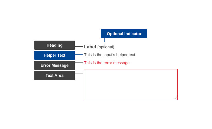
| Heading | Yes | Title of the text area |
| Helper text | No | Additional information the user might need, to help them provide the correct data |
| Text area | Yes | The area where the user enters their response |
Conditional (invalid or missing input)
| Elements | Mandatory | Description |
|---|
| Optional indicator | Yes | Indicator stating if input fields are optional. All fields are mandatory by default - only ask for information that is required |
| Error message | Yes | A message informing the user if there is a problem with their entry |
Do's
- minimise the number of input fields - only ask for necessary information
- arrange them vertically to improve scannability and reduce errors
- group related fields together
- order input fields logically, matching real-world task succession and interactions
- always label each text area with a short, distinct and indicative title, placed above the text area
- indicate whether the input field is optional
- make use of helper text if there are further directions or hints the users may need in completing their goal (example: Must be at least 6 characters and contain a number and a special character)
- allow copy/paste for ease of use
- if a character counter is necessary, place it below the text area
- match the text field area to the expected size of the input - make it wide enough for the user to see their entire entry
- write specific and indicative error texts so users understand how to fix the error
Don'ts
- don't use placeholder text in the text area - this may not be read by screen reading software, leading to accessibility issues
- don't have a mandatory minimum input of characters
- don't restrict the use of uncommon or special characters
- don't disable copy and paste functions
When to use
- use in any situation where the user needs to input a large, or unknown, amount of data
When not to use
- do not use when expected input is short or limited - use a Text field instead
- do not use when the user must respond with specific options which are known to the organisation - use form types such as Checkboxes, Radio Buttons or Selects instead
Notes
Accessibility
- placeholder text in a text field is bad for accessibility - may not be read by screen reading software, and can be problematic for users with a visual impairment; use helper text is further information needs to be conveyed
Related components