A text field is an input that can be used on a form, sign-in or any place where data is requested from the user. Its intent is for limited amounts of information; for larger amounts of text, use a text area.
Anatomy
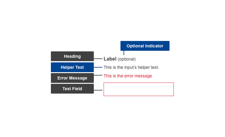
Default
| Elements | Mandatory | Description |
|---|
| Heading | Yes | Title of the text input field |
| Helper text | No | Additional information the user might need, to help them provide the correct data |
| Text field | Yes | The area where the user enters their response |
Conditional
| Elements | Mandatory | Description |
|---|
| Optional Indicator | Yes | Indicator stating if input fields are optional |
| Error message | Yes | A message informing the user if there is a problem with their entry |
Do's
- allow copy/paste for ease of use
- match the text field to the expected size of the input - make it wide enough for the user to see their entire entry
- write specific and clear error message texts, so users understand how to address the error
Don'ts
- don't use placeholder text in the text field - this may not be read by screen reading software, leading to accessibility issues
- don't have a mandatory minimum input of characters
- don't restrict the use of uncommon or special characters
- don't disable copy and paste functions
When to use
- use in any situation where the user needs to input limited amount of data (name, email address, age, etc)
When not to use
- do not use where the user needs to input a large, or unknown, amount of data - if longer, use a Textarea instead
- do not use when the user must respond with specific options which are known to the organisation - use form types such as Checkboxes, Radio Buttons or Select instead
Notes
Accessibility
- placeholder text in a text field is bad for accessibility - may not be read by screen reading software, and can be problematic for users with a visual impairment; use helper text if further information needs to be conveyed
Related components