The accordion is a progressive disclosure component. Such components truncate information for the general layout/design and are intended to deliver optional additional content depending on users' interest. They help keep the interface clean and reduce scrolling by saving vertical space.
Accordions display easy to scan labels of the relevant information, indicative of the additional content that is available through extra interaction. For this reason, accordion labels (collapsed state) should be as descriptive and concise as possible, helping users to form a mental model of the information available.
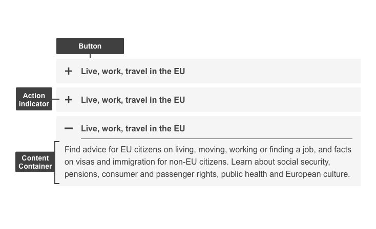
Anatomy
- Mandatory
- Optional
| Elements | Mandatory | Description |
|---|---|---|
| Action indicator | Yes | Varies depending on the state (collapsed/expanded). Indicates what the next action will do - expands/collapses content container on click |
| Button | Yes | Actionable item (expands/collapses) - The button label must be short and descriptive of the action that follows after being clicked. Contains Label & Action indicator |
| Content Container | Yes | This element displays relevant content in a container that's initially hidden |
Do's
- use labels that are representative of the content inside the (initially hidden) container
- order logically (e.g. 1st quarter, 2nd quarter, 3rd quarter, 4th quarter)
- make sure this component is needed (reduce vertical space) and users will benefit from the added interaction cost
Don'ts
- don't use unless users will benefit from easy-to-scan, truncated, information
- don't use actionable items (i.e. forms, accordions, buttons, CTAs, etc.) or pictures in the content container as they will have decreased visibility
- don't use when there are under 3 pieces of information
- don't hide important information that should be present at all times
- don't use long labels, ideally keep it to one line, maximum 2
- don't have over 7 lines of text in the content container
When to use
- when you need to present multiple sections of content in a simple way on one page, without overwhelming the user (especially applicable to mobile)
- when it’s not critical for every user to read every section of content, adding value when a user wants to compare different sections (multiple content containers can be opened simultaneously)
- when you can make extensive and complex content easier to digest through descriptive labels
When not to use
- don't use when pages are short (reading time: under 3 minutes)
- don't use when information would be better structured horizontally (does not need comparison between sections) - use tabs instead
Notes
Accessibility
- progressive disclosure elements can be helpful accessibility aids as they give users the choice of revealing content to read or bypass, making page navigation more efficient for screen-reader users and people using the keyboard or alternative input devices
- make sure the component is printer-friendly, thus coded to be in the expanded state when printed