The radio button component is an input with at least two, mutually exclusive options, where just one selection can be made at any time so that an option is selected, the other options are deselected.
Anatomy
Default
| Elements | Mandatory | Description |
|---|
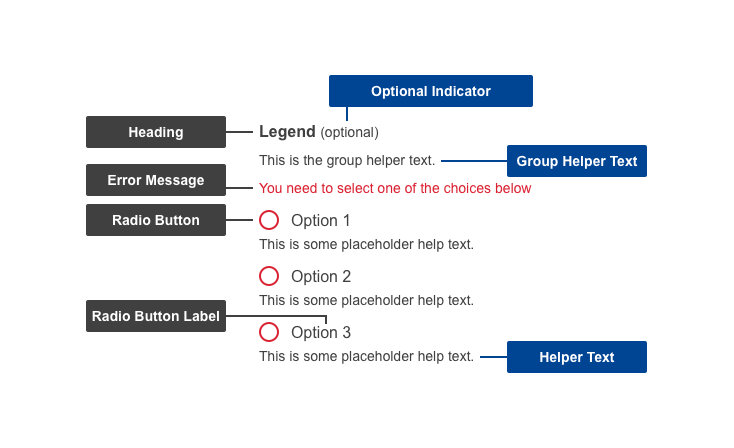
| Heading | Yes | The heading of the group of related radio buttons |
| Group helper text | No | Helper information to describe the radio button group |
| Radio button | Yes | The actionable part of the component - either selected or un-selected |
| Radio button label | Yes | The label of the radio button |
| Helper text | No | Helper information to assist the user in selecting the appropriate radio buttons |
Conditional
| Elements | Mandatory | Description |
|---|
| Optional indicator | Yes | Indicator stating if input fields are optional. All fields are mandatory by default - only ask for information that is required |
| Error message | Yes | A message informing the user if there is a problem with their entry |
Do's
- aim for distinct headings within the same group in order to improve scannability and reduce possible confusion
- use labels as click targets (clicking the label will select that option)
- arrange them vertically to improve scannability and reduce errors
- group related fields
- order logically (e.g. ages 18-25, ages 25-35, ages, 35-50, over 65)
- indicate whether the input group is optional - if it's mandatory, have a neutral option (e.g. other, n/a) selected by default
- make use of helper text if there are further directions or hints the users may need in completing their goal
- write specific and clear error messages, so users understand how to address the error
Don'ts
- don't add them without grouping first, in a logical order of successive tasks
- don't nest elements under radio buttons - keep all the options on the same level
When to use
- when you have under 10 items
- when only one selection is needed from a list
- when users need to select options or toggle settings, for example
- in forms with multiple non-exclusive options (e.g. search filters)
When not to use
- avoid when more than one option can be selected
Related components