The checkbox is an input with at least two non-mutually exclusive options, where more than one selection can be made at any time.
Anatomy
Default
| Elements | Mandatory | Description |
|---|
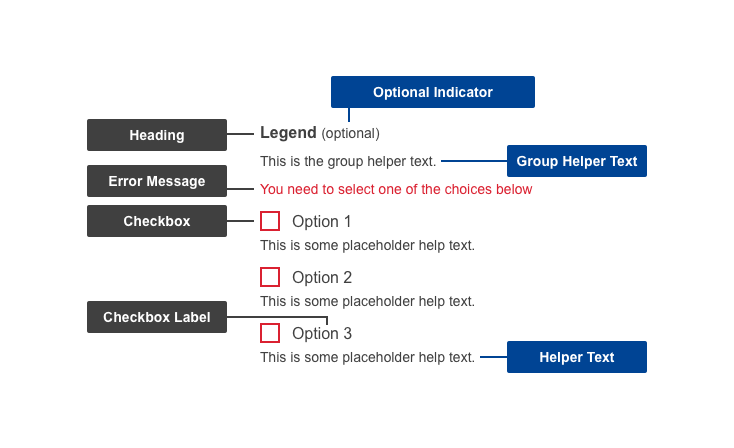
| Heading | Yes | The heading of the group of related checkboxes |
| Group helper text | No | Helper information to describe the checkbox group |
| Checkbox | Yes | Actionable part of the component - either ticked or un-ticked |
| Checkbox label | Yes | The label of the checkbox, also actionable |
| Helper text | No | Helper information to assist the user in selecting the appropriate checkbox |
Conditional
| Elements | Mandatory | Description |
|---|
| Optional indicator | Yes | Indicator stating if input fields are optional. All fields are mandatory by default - only ask for information that is required |
| Error message | Yes | A message informing the user if there is a problem with their entry |
Do's
- always make sure each checkbox has a short, distinct and indicative checkbox label
- aim for distinct checkbox labels within the same group in order to improve scannability & reduce possible confusion
- use checkbox labels as click targets (clicking the label will select that option)
- arrange them vertically, in a single column layout to improve scannability and reduce errors
- group related fields
- order logically
- indicate whether the input group is optional
- make use of helper text if there are further directions or hints the users may need in completing their goal
- write specific and clear error messages, so users understand how to properly address and recover from the error
Don'ts
- don't add them without grouping first, in a logical order
- don't restrict the number of checkboxes that can be ticked at any time
- don't nest elements under the checkbox - keep all the options on the same level
When to use
- use in any situation where the input information is known to the organisation
- when users need to select options or toggle settings
- in forms with multiple non-exclusive options
- in search filters
- to turn a setting option on or off
When not to use
- do not use it when you have mutually exclusive items - use radio buttons instead
- do not use it if the checkbox selection will perform an action
Related components