The expandable is a progressive disclosure component. Such components truncate information for the general layout/design and are intended to deliver additional content depending on users' interests. They help keep the interface clean and reduce scrolling by saving vertical space, while being indicative of the additional content that is available through extra interaction.
Anatomy
- Mandatory
- Optional
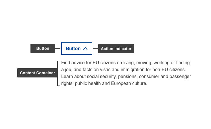
| Elements | Mandatory | Description |
|---|---|---|
| Button | Yes | Actionable item (expands/collapses) - The button label must be short and descriptive of the action that follows after being clicked Contains Label & Action indicator |
| Action indicator | Yes | Varies depending on the state (collapsed/expanded). Indicates what the next action will do - expands/collapses content container on click |
| Content Container | Yes | This element displays relevant content in a container that's initially hidden |
Do's
- use a button label for each item with a short, distinct and indicative title of the hidden content
Don'ts
- don't use with large blocks of content
- don't hide important information that should be present at all times
When to use
- use when additional information is offered that will only benefit a small group of users
- when you can make extensive and complex content easier to digest through descriptive labels
When not to use
- do not use as a button
- do not use it consecutively - use accordions instead
- don't use when pages are short (reading time: under 3 minutes)
Notes
Accessibility
- progressive disclosure elements can be helpful accessibility aids as they give users the choice of revealing content to read or bypass, making page navigation more efficient for screen-reader users and people using the keyboard or alternative input devices