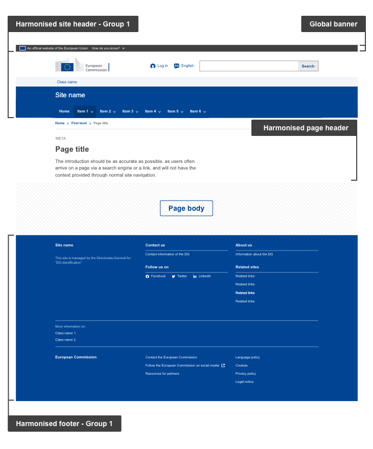
On this page you will find information related to the European Commission branded Harmonised group 1 websites that host specific content that answers a particular communication purpose, in particular:
- Web information systems - Providing a user-friendly interface to generate, disclose and/or filter large, detailed amounts of data stored in different systems
- Network websites - Websites or platforms set up and managed by the European Commission (as a service provider) to encourage and facilitate interaction among a specific, non European Commission target audience
- Internal policy websites - Providing information on internal working methods of the EU institutions, standards and guidelines. Resources for institutions’ employees, partners and service providers
Anatomy

- Mandatory
- Optional
| Elements | Mandatory | Description |
|---|---|---|
| Global banner | Yes | The Global banner is the official EU stamp that gives a visual indicator and easy access to EU institutions and bodies sites, guaranteeing the user visits an official EU website |
| Harmonised site header | Yes | The Harmonised site header is present on every page. It communicates the European Commission brand and provides basic structure and guidance. The site header is composed of several mandatory and optional elements such as:
|
| Harmonised page header | Yes | The Harmonised page header gives context and information to the user on what the page is about. It is present on every page, just below the site header, except for the homepage. The page header is composed of mandatory and optional elements such as:
|
| Harmonised footer | Yes | The Harmonised footer is present on every page. It provides supplementary information such as copyright, legal, privacy, social media, contact information and links to other important sections within the European Commission ecosystem. The footer is composed of mandatory and optional elements such as:
|
NOTE: On the Page body section, when components are available, use components from ECL.
Structural anatomy
When designing the page, make sure to follow appropriate category guidelines available below in terms of structure and layout
| Elements | Mandatory | Description |
|---|---|---|
| Grid | Recommended | Enhance visual consistency |
| Colours | Recommended | Use only European Commission colour specifications available in the ECL |
| Typography | Recommended | Apply the typographic guidelines available in the ECL |
| Spacing | Recommended | Apply spacing rules explained in the ECL |
| Icons | Contextual * | Where icons feature, use commonly-used icons from the ECL |
| Images | Contextual * | See image guidelines in ECL |
* Contextual – elements that may or may not feature on a page, depending on the communication and/or functional needs – for example, Login. Where the element features, use the ECL component.
Do's
- ensure the pages contain all the elements in the anatomy table above
Don'ts
- do not replace pages only on existing websites as this will create visual inconsistencies, this must be done at a site level
When to use
- the Harmonised template must be used for all new development and can also be introduced on existing pages to replace a previous template, but this should be done on a site basis, not page by page
When not to use
- do not follow these guidelines when you are updating sites that fall under the Core or Standardised category
- do not follow these guidelines when you are updating sites that fall under events, campaigns or blogs - use Harmonised Group 2 instead