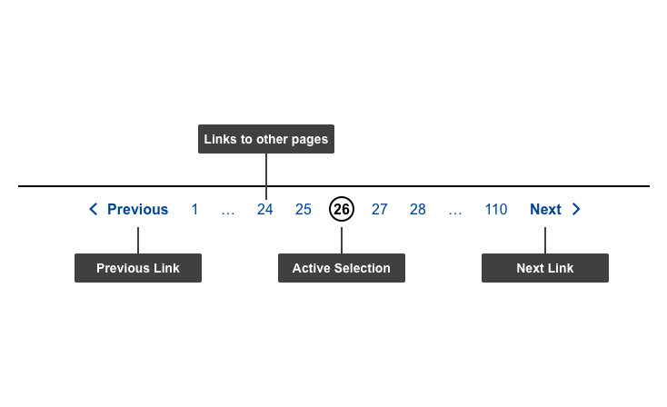
When a list of items is presented on multiple pages, the pagination component is used at the bottom of the list to indicate the number of pages, the current page and to allow users to navigate to the different pages.
Anatomy

- Mandatory
- Optional
| Elements | Mandatory desktop | Mandatory mobile | Description |
|---|---|---|---|
| Links to other pages | yes | no | Links leading to pages and their corresponding value |
| Active selection | yes | yes | Represents the current page the user is on |
| "Next" link | yes | yes | Links to the next page; it is not displayed on the last page |
| "Previous" link | yes | yes | Links to the previous page; it is not displayed on the first page |
Do's
- place the pagination below the list of items
Don'ts
- don't replace this component with an ‘infinite scrolling’ feature
When to use
- use to break long lists that would create too much vertical scrolling in one page
When not to use
- don't use to break unrelated content on different pages
Notes
Design
- 3 dots (…) is used to indicate that there are more pages in-between
- first and last pages are always displayed