A Hero banner displays a prominent message and related action. Banners are displayed on the homepage below the site header of European Commission sites. It conveys an important message to your audience. Hero banners are a good way to channel your visitors to complete a specific task, for example register to an event or apply for funding. The user can choose to ignore them or interact with them at any time.
Anatomy
Banners display a focused message and provide users with clear action to take. They are placed at the top of the page below the site header.
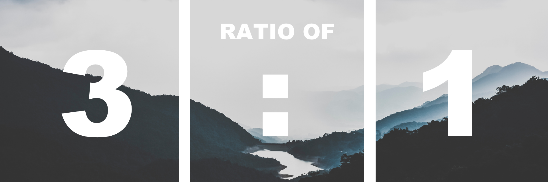
Hero banner images have an aspect ratio of 3:1, meaning the width will be always three times the height of the images.
| Components | Constraint | Restrictions |
|---|---|---|
| hero image | optional | choice between 2 background colours when there is no image |
| description | mandatory | 100-150 characters maximum, including punctuation |
| call to action | mandatory | 3 words – 25 characters maximum, including punctuation |
When to use
- Exclusively on the campaign websites
- To communicate important messages channeling the user to take an action.
When not to use
- Do not use more than one banner at a time.
- Do not use on a website other than campaign.
DO's
- The supporting illustration is:
- relevant
- high quality
- emotionally persuasive
- the minimum ratio is 3:1
DON'Ts
- Use more than one banner per page
- Use banner on pages other than homepage or landing pages

